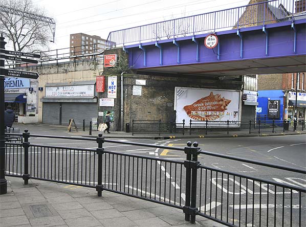
Today was our first lesson in colour theory. 2 words: Colour wheels. Gosh that took me back a few years but it was fun! Now that I refreshed and revived my outlook on colours the world just seems so much more...colourful... not exactly like the place underneath on the left because its obviously not our grey hatfield *sighs* but I'm sure you get my point.
So yes, its that time of the year when the leaves turn into beautiful hues of reds, browns, oranges, golds and other warm colours.
Even though the weather is becoming more chilly, its weird how a visually warm environment changes absolutely nothing...
..bit like a slap in the face really =(
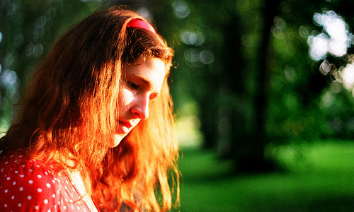
But back to the point, our teacher was saying about the clothes we wear and to be honest, I actually do colour coordinate my outfits according to season and today I'm wearing this:
Harmonious colours on the colour wheel: orange and red orange (I like to call that colour blood orange) The photo is a bit dark but you can still see the colours I guess.
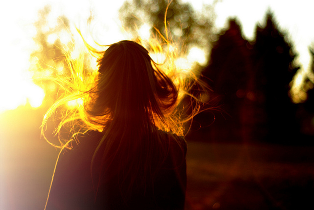
Tomorrow I will post a photo of a building in uni I saw today, it has some interesting and contrasting colours.
 But before I forget, being on the topic of autumn, there was a Korean film I saw a few days ago actually, and the colour grading on the entire film was amazing.
'A Bittersweet Life' by director Jee-woon kim and staring Lee Byung-Hun.
But yeah, the whole film was tinted towards a warm orange
You cant really see too well in the screenshot below, but if you watch the film you can see that most of time, the colour black isn't black at all, but more of a warm brown. Also at certain points the film is almost in sepia which really seems to draw you into the film more.
Its worth watching as there's a lot we can learn from foreign films really.

 Ohh what a lovely saturated picture of china...obviously somewhere away from the grey pollution of the capital


_5328760149.PNG)